How do we make a city feel like a real place? How can we make it feel alive - like it exists independently of us?
I am far from an expert. Some of the images that go up on Reddit are little short of extraordinary. But a lot of those realistic-looking cities depend on vast numbers of mods and assets. For anyone on a console, an elderly PC or who prefers to play vanilla, that approach isn’t going to work.
There’s a lot of tools and techniques in the base game we can use to make cities look more natural and authentic. And here I’ll go into a few ideas and things I use to try to bring cities to life.
It’s worth saying I’m not talking about cities that look ‘realistic’. By default, Cities: Skylines has quite a cartoony look, probably inspired by 2013’s SimCity. Personally, I like it, but I do understand the desire for a more muted, gritty appearance - and perhaps that would be great for a future sequel.
But without really getting into editing the colours and assets in the game, ‘authentic’ is a lot more achievable than ‘realistic’.
What’s the story of the city?
Before you even load into a map, it’s worth having an idea what the city is going to be about. What is its focus? Type of business? Will it be an exporter or importer? A tourist destination (guide here) or an industrial powerhouse (guide here)? Once you’ve got an idea, build around that.
Not all the questions need to be answered, obviously, but having a general idea will let you build each district with that character in mind. Ultimately, the city will feel much better realised and alive if it has a purpose.
Maps with challenging geography
It’s tempting to pick maps with wide open spaces and very little to get in the way. And in truth that’s a good place to start if you’re still learning the game’s systems. But after that, look for cities with some geographical restrictions.
Maps like Natural Disasters’ Archipelago have lots of water and not much buildable space. Others have wide rivers, tall hills and steep slopes. The point is that by choosing a map that constrains you, the city will look like it’s a product of its environment, rather than an alien spaceship that’s just landed in the middle of a plain.
Having said that, maybe your city is a cluster of small industrial towns in a wide, flat expanse. In which case the challenge is convincingly blending the edges of the city into the empty surroundings. Which is tricky!
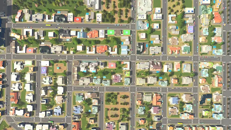
Hand-drawing high-density buildings
This is a way to reduce the size and proximity of high-density residential blocks. It helps avoid the ‘urban jungle’ effect and can also be used to help merge lower density areas with higher density ones.
It’s quite time consuming and is something I picked up from YouTuber ImperialJedi. Essentially it involves zoning plots individually rather than en masse. So instead of filling or dragging across an area, you just draw a fairly random selection of plots.
A 2x2, a 3x3, a 4x2… the occasional 4x4. You get the idea. The point is to avoid getting rows of adjacent 4x4 blocks which can look overbearing unless it’s right in the city centre. Depending on the finished look, you either leave the gaps empty or just fill them with low-density buildings.
Parks and footpaths
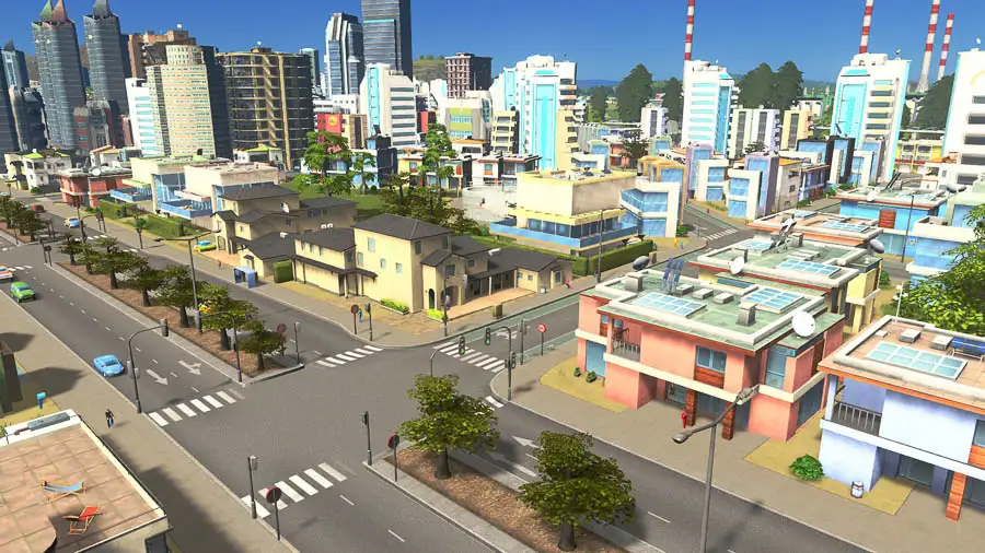
This is pretty obvious! A simple way of making an area look less homogeneous is to break up buildings with other things. Parks, playgrounds, tennis courts, gardens, carousels - there are tons of options. They all increase happiness and land value, and visually break up an area to make it look more natural.
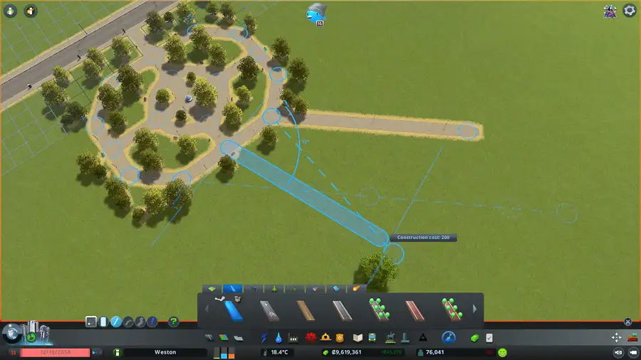
They can also be functional: some of the paths have paths inside them that can be connected to footpaths outside. Hook them up and residents can use them on their walking route! That brings more pedestrians within reach of public transport, meaning fewer cars.
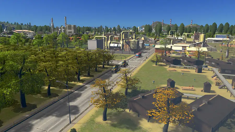
Trees and rocks
Before Parklife, I never really used trees to fill out an area. But I saw how quickly it turned a fairly ugly patch of green into something that looked a bit more real. I was shocked at how easily rocks do the same thing.
Liberally add them in gaps between buildings and roads to add some much needed visual variety. Switch between the different types and just stick them down either randomly or deliberately depending on the finish you’re after.
Mixing specialisations
With all the expansions that have come into the game, we’ve got a lot of ways to vary the default zoning. There’s two residential zone types (generic and self-sufficient), and three commercial types: generic, leisure and tourism.
Because specialisations need to sit within their own districts, it’s not really practical to mix buildings from one to the next. But to avoid homogeneity, it’s worthwhile adding small sections of different building types.
So in the middle of a neighbourhood, maybe add a small leisure area. Bars, clubs and arcades will spring up, giving a town a sense of a nightlife. Visually, the self-sufficient buildings are quite distinct from the generic ones, so the same thing applies.
Highrise ban
This city policy stops the tallest buildings from being built. Its drawback is that it prevents buildings from upgrading to their maximum level. That hits tax income, which means you might not want to use it too liberally.
The policy lets you hold back the tallest buildings. These can be used as a way to create a slightly better merger between high- and low-density housing. In the absence of a medium-density residential zone, this is another option.
Historical buildings
With the free patch that launched alongside Industries, we got the option to toggle ‘Historical building’ for upgradeable/growable buildings. When turned on, buildings can still upgrade but won’t change their appearance when they do. This can be used to retain visual variety in an area or avoid the biggest buildings from spawning. I’d like a way to do this for an area or district, but it’s a great option that doesn’t have the downside of Highrise ban.
Alternating grids
This might be my favourite style, especially for low-density buildings where you can still see the roads from a distance. It’s a grid but with some of the arms taken out. By just removing a few connecting arms you end up with something that looks a lot more natural.
Curved grids
Even if you’re using standard grid patterns, it’s not hard to mix things up a bit with curves. Instead of drawing straight lines, use a free hand when connecting things up. That disrupts the uniformity and avoids patterns. It also breaks up the zoning, meaning that a wider range of building types and sizes spawn.
Random grids
A somewhat chaotic approach is simply to draw as randomly as you can. Perhaps start with two arms that will act as main roads in and out. Then fill in the gaps completely haphazardly. In general, this works better with low-density housing to avoid a traffic mess. Having said that, bad road design can be alleviating through excellent path design.
Community centres
Instead of vast residential, commercial and industrial areas, making areas mixed-use helps them look and feel natural.
It’s good to think of new districts as towns built around a high street and community centre. I tend to put schools, parks, sports facilities, police and fire stations, and a few blocks of low-density commercial together. Around that, offices and high-density residential give way to low-density residential suburbs.
Town centres like this look good, and they have functional benefits, too. By spreading out demand across the city, traffic management becomes significantly easier. It also gives a focal point for public transport connections like a metro or monorail station.
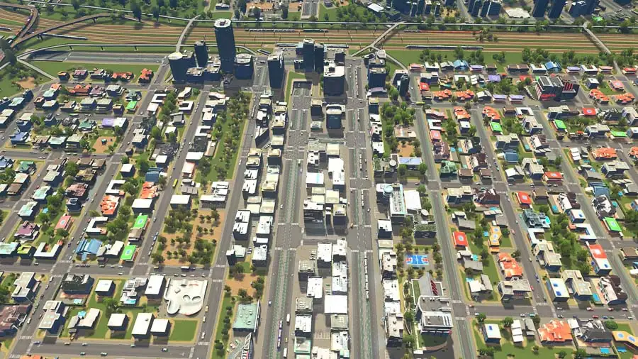
Low-density commercial and offices
Although all commercial buildings make noise, low-density commercial is quiet enough that it can sit near (although perhaps not literally next to) houses. Adding small sections of commercial buildings at regular intervals can make places look more real.
It especially makes sense that busy parts of town are complemented by shops and cafes. That applies to things like public transport stops and universities. Offices don’t make noise, so adding a few blocks of those work too.
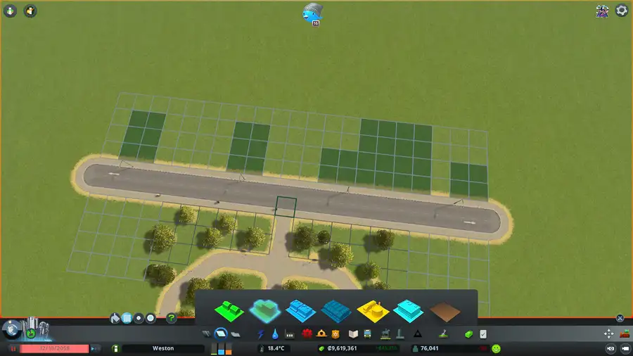
Twelve unit slopes
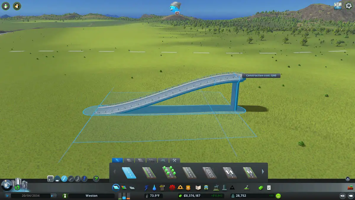
When drawing slopes for bridges and tunnels, the maximum distance is 12 grid squares. After that, you’ll notice the game add more flat road and start the slope further down. By measuring out to twelve every time, you’ll get the smoothest gradients possible.
Combine that with lowering the elevation steps and you’ll get nice, natural looking up and down ramps throughout the city.
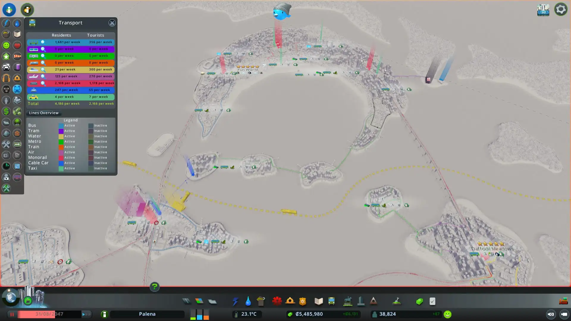
Choose the right public transport types
I’ve done a rundown of transit options here. There, I said the metro is probably the game’s best public transport. That said, it’s not always the right type for a natural-feeling city.
Deciding your city’s story goes hand in hand with choosing the type of transport options it’ll have. It’s weird to have a metro system for a connected series of small industrial towns (same goes for the monorail!). It’s equally weird to use it on a map of islands.
Making an authentic city often means limiting yourself to certain transport types. They might be less efficient or cost a lot more, but you’ll end up with more satisfying result.
Fewer highways and tunnels, and narrower roads
Given their speed, it’s tempting to use a lot of highways, especially in response to bad traffic. Functionally, that’s usually not the best response (I’ve written about how to reduce road traffic demand). On top of that, too many highways can make a city - especially a small one - look a bit odd. Stick to smaller road types wherever you can.
IRL tunnels and bridges are expensive, so they don’t tend to be thrown up everywhere. For a more realistic finish, they’re best kept to a minimum. Same goes for bridges that pass over bridges. They’re fine for huge interchanges and the centres of big cities, but everywhere else they look too much.
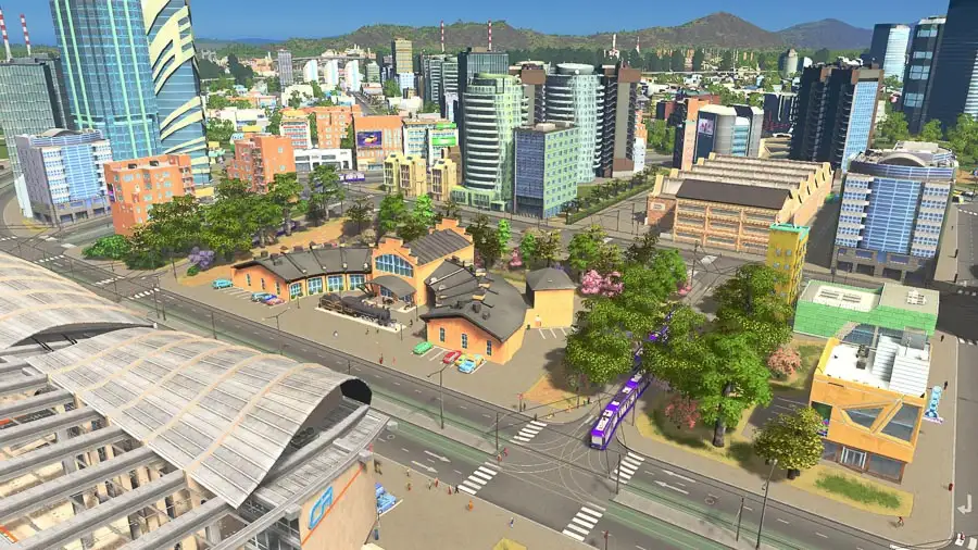
Campus, administrative and business districts
Although they aren’t functional (I’d love the Parklife template applied to stuff like education), these bring a district to life. By combining an actual university with some of the unique buildings it’s possible to create a convincing campus.
There’s a bunch of classical buildings that look like the ‘original’ university building, as well as things like the Observatory and Climate Research Station. All those bring in visitors and make the place look busy. You could even add some residential areas to stand in for student accommodation.
Similar things work for a city government area or a business park. By taking inspiration from life and thinking about how to make mixed-use areas you can create areas with real character.
Accept imperfections
Real cities are compromises. Every decision is bound by money and politics. People usually don’t want their buildings demolished and there’s a thousand other complexities. Although in Cities: Skylines we should never be afraid to bulldoze areas to make room for something better, in some cases, it’s better to leave a sub-optimal setup in place and build around it. The slightly chaotic result looks more natural because that’s what real cities look like.
Get into urban planning
I guess we’re all into urban planning to some extent or other. But some people are really into urban planning. This incredibly detailed guide takes a lot of planning principles and talks about how they relate to Cities: Skylines.
This slightly more relatable set of images from ‘When a Landscape Architecture student plays Cities: Skylines’ is some great inspiration - albeit from a well-modded game. Lots of players actually turn to Google Maps and draw out road networks that mimic their favourite or home city.
Roundup
There you go! Thanks for reading. I hope you found this useful. As I said at the start, I’m very far from an expert on this. I’d love to hear your ideas and I’ll incorporate them here if you’d like.